In this special 2 Part series, I am going to delve deeper into the realm of Color Management. We have touched on the topics a few times, but have never dug into discussing Color Spaces or ICC profiles. In today’s post, I am going to take a look at Color Spaces, what they are and how to leverage them in your workflow.
Color Spaces are a relatively simple concept that is often mired in mystery due to all the scientific terminology that surrounds and defines the concept. Simply put, a given Color Space is capable of reproducing a certain range of the visible light spectrum, and different Color Spaces reproduce differing ranges of said spectrum. There is much, much more to the concept, but for all intents and purposes that is the gist of the matter.
Color Spaces are important to any color management workflow, as the Color Space literally defines the way digital input from an image file is rendered on screen or in print. Even if your monitor is properly calibrated (which it is, right?), you can still get horrible print output due to utilizing an improper Color Space at time of export.
You will not notice the issue on screen, as your operating system controls the color spectrum on your monitor, but if you accidentally print an image made in the ProPhoto RGB Color Space at the local Wal-Mart, you may be dissatisfied with your print quality. We are going to try to avoid that situation.
First, let’s look at the most common Color Spaces in use today.
- sRGB The “standard” of the web and most photo finishers. Designed in 1996 by Microsoft and HP sRGB has the smallest spectrum of colors of the primary Color Spaces. sRGB was primarily designed for the computer industry as a way to standardize colors o monitors and printers.
- Adobe RGB Designed by Adobe in 1998, attempting to duplicate the spectrum of colors created by the CMYK printing process. Offers a wider range of available colors than sRGB. Adobe created Adobe RGB for the growing computer graphic arts sector, leading to a wide adoption by photographers.
- ProPhoto RGB Created by Kodak and approved in 2003, ProPhoto RGB started its life out as ROMM RGB. Designed from the ground up as a Color Space designed to supplicate all the colors visible in Ektachrome slide film, ProPhoto RGB has one of the largest color gamuts out there. Designed by photo experts for photography, ProPhoto duplicates most of the humanly visible colors that occur in the real world, surpassing Adobe RGB by a long shot.
- Melissa RGB Another Adobe defined Color Space, but only used inside of Lightroom. Melissa RGB is the Color Space all your RAW files are manipulated in inside Lightroom, as you cannot select another working Color Space. However on export you must select an appropriate Color Space to export to. Melissa RGB utilizes the ProPhoto color spectrum and applies the Gamma curve from sRGB, providing the best of both Color Spaces.
There are countless other Color Spaces available, but these four are the most common you will run into while using Adobe products. The image below shows the Visible Color “horseshoe” with the sRGb, Adobe RGB and ProPhoto RGB Color Spaces superimposed over it.
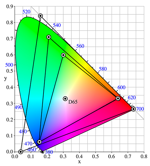
The smallest triangle represents the sRGB Color Space and the range of the visible spectrum it is able to re-create. The inner triangle is the Adobe RGB Color Space, covering more available gamut, while still containing just over half of the visible spectrum. The large, outer triangle represents both ProPhoto RGB and the Melissa RGB Color Spaces, as they share the same general gamut. As you can see, ProPhoto looses only some of the green-blue and purple-red spectrum.
At the same time, ProPhoto delves deep into the visible reds and actually charts off past visible green and blue. D65 refers to a standard illuminant which is roughly equivalent to mid-day sunlight and is the basis for gamut analysis.
Simply looking at the diagram should entice you to use ProPhoto RGB, however you should generally only use ProPhoto during your editing phase. Also, you only want to use ProPhoto RGB on 16-bit images, as its color gamut exceeds the capabilities of 8-bit images and can create visible color banding.
When using Lightroom, you do not have to worry about Color Space at all while editing images, as all editing is done inside the Melissa RGB Color Space. However if you are going to open your images in Photoshop, you will want to be color space aware and be sure you have your Preferences in Lightroom configured.
Technically you can set these settings to any Color Space Lightroom offers (sRGB, Adobe RGB or ProPhoto) but to get the most from you images, you will want to make sure you configure Lightroom to export to Photoshop a 16-bit ProPhoto file.
To configure your settings, select Edit >> Preferences from the menu bar or use the keyboard shortcut {Ctrl/Cmd + , }. This fires up the Preferences dialog. Select the External Editing tab from the Preferences dialog.
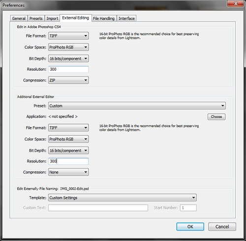
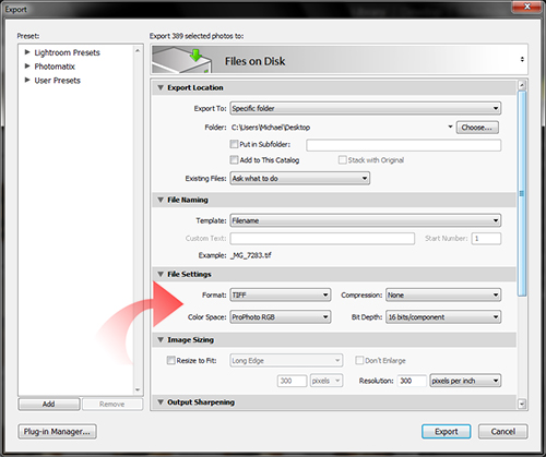
Make sure you set the Color Space to “ProPhoto RGB” and Bit Depth to “16 bits/component“. Everything else is best set to suit your tastes (yes, I use TIFF/ZIP and 300 PPI). Click OK, and now whenever to choose Edit in Photoshop… in Lightroom, your file will open into Photoshop in 16 bit mode inside the ProPhoto Color Space.
Now why would you want to edit your images in the ProPhoto Color Space when we all know that you are just going to have to convert it to 8-bit sRGB whenever you export the image for Web or sending off to a lab? Simple, better color fidelity.
With more available colors in the ProPhoto Color Space you can edit your image more naturally and can produce superior results to sRGB or AdobeRGB. This is also the reason that Lightroom utilizes Melissa, which is based off ProPhoto, you can get more natural colors and perfect you images much easier.
Since the image is in an expanded Color Space at a high bit-depth, there are more subtle shades available to you. If you edited in Photoshop from Lightroom, you can save the derivative TIFF file at 16-bit ProPhoto and Lightroom will handle it just fine. Just click Save.
However, if you are going to save to jpeg right from Photoshop to create you output file, you will need to take additional steps. First you want to change Color Space. From the menu, select Edit >>Convert to Profile… to bring up the Convert to Profile dialog.
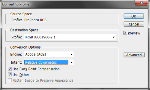
Simply select the desired Color Space, which will be sRGB if you plan on using the image on the web or sending off to most print labs. All the options underneath affect the conversion of the Color Spaces, for now ignore them. In general, the defaults will provide fine results, and altering the options is beyond the scope of this article.
Once you click OK Photoshop will work to duplicate the same colors in the lesser Color Space. It will use dithering, black point adjustment and nearest neighbor tools to generate a version of your image in sRGB, even though sRGB contains much fewer colors than ProPhoto. Most times the conversion will not even be noticeable to your eyes.
Next, you will want to reduce the bit-depth to 8 bit, which is required by the jpeg standard. From the menu bar select Image >> Mode >> and then click on 8 bits/channel.
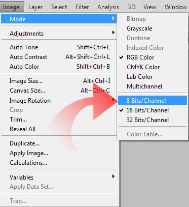
Your image has now been converted from 16 bit ProPhoto RGB to 8 bit sRGB and is ready for its voyage into the wild. You now know how to prep a file exported from Lightroom to Photoshop for web/print.
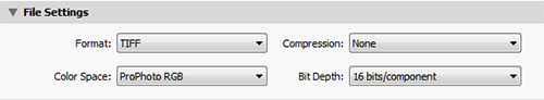
Now, turning our attention back to Lightroom. Any time you export an image from Lightroom; raw, tiff or jpeg, you are presented with the opportunity to set Color Space and Bit Depth for the exported file. Inside the Export dialog of Lightroom, look to the File Settings panel.
When you are exporting from Lightroom to edit later in Photoshop or another editor, I recommend these settings.
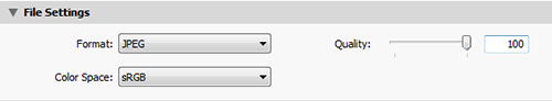
When exporting for web or print, be sure to change the Color Space to sRGB (and Format to JPEG, normally).
In general, you always want to edit using the ProPhoto RGB in Photoshop. You have no choice but to edit using Melissa RGB in Lightroom. Using the larger Color Space allows you to use the tool with the greatest capabilities, Photoshop and Lightroom will then help you pare down you image to a smaller profile for use. Normally the smaller Color Space will be sRGB, as it is still the “standard” Color Space of the Web and almost all printing labs request files as 8-bit jpeg files in the sRGB Color Space.
It really sucks to lose color fidelity in the conversion, but for now it will have to do.
One thing you may notice here is that I have not mentioned Adobe RGB since the beginning of the article. Well, that’s because in today’s modern RAW workflow, there is precious little need for Adobe RGB. If you shoot RAW, you do not have to worry about Color Space until you export from Lightroom or open your RAW file via Adobe Camera Raw.
Raw camera data has no Color Space, Color Space is determined at time of rendering. Since ProPhoto offers one of the best color gamuts to date, it should be you default choice, ther is no need to edit in lesser Color Spaces.
However, you should set your camera Color Space setting to Adobe RGB, in case you ever shoot JPEG (unless your camera offers ProPhoto as an option, then choose it). Shooting JPEG is bad enough, but shooting JPEG in sRGB is really limiting your images before you even get them into Photoshop or Lightroom.
If you shoot/have to shoot JPEG, give your images the benefit of being saved to the Adobe RGB Color Space.
The added color gamut can really help you out when editing. Just be sure to convert you image to sRGB before you do much else with it.
In short, open and edit you files in ProPhoto RGB as a 16 bit image. Export you images for use in sRGB as an 8 bit image. Only use Adobe RGB when shooting JPEGS in camera, it has no other legit use in today’s photographic workflow.


