Grab yourself a coffee (or something stronger) and get ready for part 3 of The Step-By-Step Guide To Photography Style. If you need to refresh your memory regarding the first two parts, they can be found here and here.
So far we’ve looked at what style is and why you should have it, the differences between style and trend, ways to acquire style, the pitfalls of copying someone else’s style, and the evolution of a couple of photography’s living greats.
The XEQUALS platform can be a very powerful way to help you both discover your style and remain consistent.
Now though, it’s time to dive into the process of taking a raw image and developing it quickly so that it syncs with your particular style.
To do that, we’re going to be working with the XEQUALS presets. I’ll be using the Lightroom versions but if you’re a user of Adobe Camera Raw, there’s also a set for you.
Using Presets To Fast Track Style
Presets are extremely versatile. At the basic level, you can import your photos, select a preset, and be done. There are plenty of people who do just that and are happy with the simple workflow it offers.
For the photographer who is developing his/her own style though, they offer so much more. Using presets as a starting point and then tweaking things to taste can be the beginnings of discovering your own style.
When you realize that you’re prone to make similar adjustments to similar images, you’re starting to find your own style.
In part 2, I talked about Steve McCurry. While he’s been digital for the past decade or so, for the majority of his career he was known for his work with Kodachrome film. As you explore your own style, you may want to consider something like this as a starting place.
You’re not going to be copying him, instead you’re giving yourself somewhere to start from.
Manipulating Masters
The two images below are the unedited, out-of-camera version, and a version that has applied a Kodachrome 10 v2 Tone LC preset.
I now have a starting point. When Lightroom imports RAW images, it places its own display defaults on the image. I’ve never met anyone who liked those defaults but there’s nothing that says you can’t use a preset as your own default or starting place.
In the version below, I’ve adding some light into the shadows, and tweaked the Blue Channel of the Curves panel. It brings a little more light and color into the clothing and makes it pop somewhat.

Next, I’ll go into the HSL panel and push up the orange saturation, and tweak the hue of the blues, and with that, I’m happy. The blue/orange combination is one I like a lot. And that simple discovery could be a glimpse into a personal style that works for me.

What If I Think I Already Have A Style?
Let’s say I’ve got a particular style already and want some new images to be in the same or similar style as some older ones.
To better show the steps taken to go from the out-of-camera image to the final version, I’ll walk you through a recent shoot that a local talent agency commissioned me to do.
Keeping It Consistent Is Actually Easy
First, a little backstory. About a year ago I teamed up with a theater director who was putting on a 24-hour theatre event, where short plays are cast, written, wardrobed, rehearsed and performed over a 24 period of time.
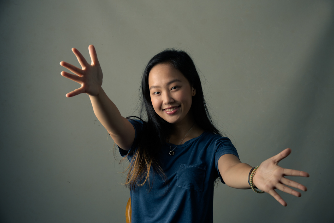
I went in for a couple of hours and made a series of headshots of all the actors who were taking part. The image below was created during that event.

Fast forward to this year, and a couple of weeks ago a local actor got in touch with me. He was putting on an acting workshop and wanted to hire me to come along and make another series of similar headshots for the participants.
The space available had a projector screen in place so that became the backdrop for the shots. I normally like to get my lights high but low ceilings limited the vertical reach. In the end, I opted for a simple cross-light/Rembrandt lighting setup with a strobe in a gridded 48” octabank to the subject’s right, and a large white reflector to their left.
There was a slight difference to how I lit the series last year. But due to space constraints the final images would have a similar style, rather than be exactly the same.

As I almost always do, I shot tethered into my travel laptop. This allows me to apply presets automatically. However, in this instance I chose not to do that.
Why? Because I knew I’d be mixing and matching a bit to get to the final images and would be doing all the editing on my more powerful machine back in my office.
Shooting tethered was solely for issues of focus and composition, and to let the subjects get an advance preview of the images.
Once the shoot was done, and 9 or 10 actors and actresses had passed in front of my camera, it was time to begin the process of editing and taking the raw images from an out-of-camera look into the style that I’d been commissioned for.
Below is a straight out of camera image.

So the task became how to get from the captured version to the final product. Here, the XEQUALS presets did all the heavy lifting for me.
The subjects I photographed were a real multicultural mix featuring Caucasians, East Asians, South Asians and Eurasians. Different skin tones and coloring, as well as the presence or absence of makeup meant that each photograph needed its own individual tweaks here and there. Using these presets got me a long way toward the final look and saved me a whole bunch of time.
The first thing to do is to take note of what needs to happen to the photograph in order to bring it into the feel of last year’s images.
During the shoot last year, I had a gray wall as my background. This current shoot had a white projector screen.
As I was setting up for the shoot, I metered the screen so that it would give me somewhere near a mid-gray. I wasn’t directly lighting the screen so the values across the background were obviously not going to be constant due to the lighting I was using for the subjects who were placed about three feet in front of the background.
When processing last year’s series, I did a lot of the color grading work in Photoshop. This time it was time to try to do it in the raw process in Lightroom.
In Lightroom, the first thing to do was to adjust the background. It may seem a bit counter-intuitive to do that first, as the subject is the important part but my aim was to get those tones right first using a global adjustment.
Strap In And Brace Yourselves For Lightspeed
As I scrolled through the various presets, hovering the cursor over them, I could use the Navigator to get a quick preview of what each preset looked like. I decided on Color Split from the XEQUALS Color Special Effects series as my starting point. That gave me the general tint I wanted but I was after a darker look so I applied the Color Dark preset from the same pack.
At this point, I was about done with global adjustments. Applying these develop steps as presets was a matter of a minute or two to select the correct ones from the list and click them to apply. If I’d tried to do this without the presets, I’d have been dragging sliders and adjusting settings for a lot longer to get the look I wanted.
Being familiar with the presets means that a half hour edit turns into a one minute edit.
It’s time to go in with the brushes for some local adjustments. My intention here is based around dodging on her face, which I’m going to do by adding 0.50 to exposure and 33 to shadows. In addition, I’m dropping the saturation -19. The screenshot below gives an idea of the area masked.

For a final step, I’m going to pull -50 out of saturation while adding 33 to vibrance. I’m a big fan of lowering saturation while increasing vibrance, there’s something about that works so much better than adjusting only one of them.
Lastly, crop to taste and it’s done. Not exactly the same as last year, but certainly consistent in the same style.

All images © Craig Ferguson
Remember To Have Fun!
Your style and approach takes time and effort, so enjoy the journey!
Using this 3 part guide along with the XEQUALS platform will help you bring your stories to life with a style all your own.


